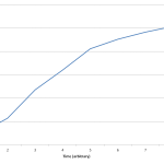
24h Growth of E. coli in D2O, DDW, DI, 30% D2O, and 60% D2O. Anthony Salvagno. Figshare.
Retrieved 19:23, Apr 27, 2012 (GMT)
hdl.handle.net/10779/5e1e8fdaeeb4d7161c1f73990d42147e
Tag Archives: data
E. coli growth experimental setup and data (on FigShare)
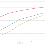
E. Coli Growth over 4 hours. Anthony Salvagno, Alexandria Haddad. Figshare.
Retrieved 20:17, April 20, 2012
hdl.handle.net/10779/b627469dabcd4034053cc53040d4dcbd
I went through the data that I posted on Tuesday and realized it was even less useful to people than I expected. I almost didn’t even know what I was looking at! Anyways, I did a couple of plots in excel with the data (which can be found on FigShare along with both the original data and the revised and cleaned data) and tried to extrapolate some other information. But first let’s discuss the experimental setup.
So on Monday, Alex created a starter culture from the E. coli we grew on plates last week. Then on Tuesday (I realize how not very real-time this post is for me, but the data came out in real-time which is also important) we made 3 dilutions of the starter culture to track the growth of the E. coli over time. We did:
- 1ml in 9ml of LB broth (1:10)
- 2m in 8ml of LB broth (1:5)
- 5ml in 5ml of LB broth (1:2)
Every hour we took an absorbance reading from the nanodrop and read the 600nm value (A600 according to the machine). We also reblanked every hour according to the instructions from the nanodrop. The initial readings were:
- starter culture – 1.076
- 1:10 – 0.097
- 1:5 – 0.23
- 1:2 – 0.665
It is interesting to note (and I literally just noticed this), that the initial readings are almost exactly what the dilutions are, ie 0.097 is ~1/10 of 1.076. Good for us!
In the FigShare data, you will find the original data (which I linked to in my post on Tues, but in Google Docs instead of Excel) and a revised data set. The data is messy but the graphs are interesting.
Also I tried to link the 3 data sets together into one coherent graph, but the time series doesn’t seem to match up right, or maybe it does and I just think it doesn’t. The 1:5 dilution seems to provide a bridge between the data in the 1:10 dilution and the 1:2 dilution. After about 2 hours the 1:10 sample overlaps with the 1:5 and likewise the 1:5 begins to overlap with the 1:2. Also at hour 3, the 1:10 sample overlaps with the 1:2 sample.
Because of this I tried to graph the data as one continuous set. It seems Like it may be alright, but I feel that the in the 1:2 sample there isn’t much growth in the 4 hours, which is reflected in the 3 data set plot, but it doesn’t look like it peaks in the continuous graph. Hmmm… Anyways check out the FigShare data.
PS I’m including the two plots I’m referring to below.
RCW: Live Results
RC5: Live Results
RC4: Live Results
This is a set of two species. The first half is arabidopsis labeled as CA (columbia arabidopsis) and the second half is tobacco labeled as VG (Virginia Gold #1). I added a second graph to chart arabidopsis growth. Since it tends to grow much faster I don’t want the data to be presented in a confusing manner, which explains having two separate charts.
I love Google Docs!
DOI: 10.15200/winn.142722.23358 provided by The Winnower, a DIY scholarly publishing platform
RC3: Live Results
For those counting along with me, the final counts won’t be out of 30. When I seal the chamber I end up crushing 1-3 seeds in the process and a couple more end up in the outer fringes where it is tough to discern sprouting or not. So I will count up the seeds in the interior circle (the fragmented one) and count the seeds that sprout from that total.
DOI: 10.15200/winn.142722.20083 provided by The Winnower, a DIY scholarly publishing platform
The Crumley Spreadsheet
Spreadsheet
If you don’t want to look at pictures of gradual change every day then you can just come back to this spreadsheet to see the numbers change and then you can look to see what days something new happened and find the corresponding images through the blog. If I remember to, I may link blog posts with activity to the day number in the spreadsheet, which would be a great idea (but like I said, if I remember).
Update: slide all the way over to the right to see links to the image notes from this notebook corresponding to that day.
Update 2: I added the original Crumley Data on a separate sheet, and I began plotting the percent germination in real time. Currently I’m not sure how to label each line in Google Spreadsheets. I can’t find a way to do it, but I’ll mention it here:
- Blue – DI water
- Red – 33% D2O
- Orange – 66% D2O
- Green – 99.9% D2O
- Purple – DDW
- Not shown – di water, no seeds
BTW: It took me a while to figure out how to do this because Google Docs changed their appearance and formatting yet again. In order to embed a Google Doc in the new format there is a “Collaborate” menu along with the usual “File, Edit, etc” menus. No longer can you go to the “Share” button and select “Publish as web page” because that button has been removed (it is not just the original share button that let’s you set documents as public and determine who you want to share with).