Category Archives: Scifund

#Scifund Challenge Round 4 with David Shiffman

https://experiment.com/projects/what-are-the-feeding-habits-of-threatened-sharks

Each day we are going to highlight one of the amazing research projects seeking funding in Round 4 of the #Scifund Challenge. Today we chat with David Shiffman, who you may know as @WhySharksMatter on Twitter. His project goes to fund (surprise!) crucial shark research, more specifically the feeding habits of sharks.

Tell us about yourself, where you are from, and where you see yourself going.
I’m originally from Pittsburgh, PA (go Steelers!), and I majored in Biology at Duke University (go Blue Devils!) I got my Masters in Marine Biology at the College of Charleston (go Cougars!) After I finish my Ph.D, I hope to do university-level teaching and research somewhere warm.
How did you get involved in your research project?
I’ve always loved sharks, and as I advanced in my education, I learned what kind of data fisheries managers need in order to better conserve and protect them. Stable isotope analysis is a non-lethal, minimally invasive technique that helps get the kind of diet and food web interactions that managers need.
Why is your research important to you? Why should others fund it?

Sharks are ecologically and economically important animals, but many species are in danger of extinction. The kind of data that I’ll be generating in my project can help.

Why did you decide to participate in the SciFund Challenge?

As an active online science communicator (@WhySharksMatter, Facebook.com/WhySharksMatter), I’ve seen the previous round of the SciFund challenge and how successful they were.

Tell us something random. Something funny. Something borrowed. Something blue.

There is a hot dog named after me at Pauly Dogs, a hot dog stand at Duke. It’s called a Shiffman, and it is a hot dog served on a twinkie.
twinkie
Check out his project here.


#Scifund Round 4 with David Pappano

https://experiment.com/projects/can-we-predict-how-social-primates-move

Each day we are going to highlight one of the amazing research projects seeking funding in Round 4 of the #Scifund Challenge. Today we introduce David Pappano, who studies Geladas (a very social primate) social organization and behavior. He also is an open notebook scientist (author note: <3)!

Tell us about yourself, where you are from, and where you see yourself going.

My name is David Pappano and I recently finished my Ph.D. from the University of Michigan-Ann Arbor. I am currently a postdoctoral research fellow in the Department of Ecology and Evolutionary Biology at Princeton University. I actually grew up in New Jersey not far from where I currently work. I am a primatologist by training—meaning I specialize in understanding the behavior, ecology, and evolution of monkeys and apes. My particular study species is the gelada (Theropithecus gelada), a species that is only found in the mountains of Ethiopia. One day I hope to blend research with teaching as a university professor, but for now I am focused on research full-time.

davidpappano

How did you get involved in your research project?

Geladas live in a modular society where small “core groups” (containing females and a single breeding male) join up and split apart from each other to create herds of over 1000 monkeys. This is really strange, because most primates live in stable groups of about 50 individuals. During my dissertation research, I noticed that “all-male groups” (containing only adult bachelor males) influenced the spacing and grouping of core groups. Basically, as bachelors approached core groups, females within core groups would clump together. This is the exact same response you would expect if the bachelors were a predator, like a hyena or leopard. I reasoned that the unit males and females responded like this because bachelors are observed to kill offspring if they enter a unit. Although this was only a small part of my dissertation research, it spurred my interest in animal movement. As a result, my current project focuses on how relationships among females within and between units influences collective movement of the entire gelada herd.

Why is your research important to you? Why should others fund it?

For me, doing science is my lifestyle as much as it is my profession. I love collecting data, analyzing (and re-analyzing) data, and solving problems. My current project is very interdisciplinary and draws from biology, ecology, and computer science to understand complex patterns of movement and herding in geladas. You should fund this project if you love primates and innovate methods to understand complex behavior.

Do you have a favorite story that came from working on your research project?

This isn’t a “favorite” story, but it is a memorable one. In April 2011 I was wrapping up my field work on my dissertation research in Ethiopia. I travelled to the capital (Addis Ababa) to speak at a Youth Conference organized by the U.S. Embassy. A few days before the conference, I broke a molar in half (ouch!) while eating doro wat (a delicious chicken stew and national dish of Ethiopia). I had to get half my tooth pulled and capped in Ethiopia. Regrettably this fix didn’t hold and I had to go back to the U.S. a few weeks earlier than I expected. I never got to say goodbye to my field assistants and park rangers in the Simien Mountains National Park. I have yet to go back to Ethiopia, but if I get funded then I will be able to return.

Why did you decide to particpate in the SciFund Challenge?

Two months ago, I unsuccessfully tried to fund this project through a crowdfunding campaign. Although I was disheartened, I reasoned that I needed a bit more time to refine my project. After speaking with the organizers of SciFund, I decided to give it a second chance.

What was the most difficult aspect of building your SciFund Proposal? What was your favorite?

Making the video was pretty tough. I’m not exactly Steven Spielberg.
My favorite part of the process so far has been reading through everyone else’s projects. Everyone is doing such great work. It is really exciting to see such amazing work from concept to completion.

Tell us something random. Something funny. Something borrowed. Something blue.

I have an identical twin brother. He works in the financial industry in New York City. A few years ago, he wanted to try out for the Amazing Race. We made a video, but we (obviously) didn’t get selected. Maybe if the whole academic thing doesn’t work out we’ll try again.
His project is available here.

Design tips for a killer presentation

I posted this to the Scifund blog but decided to share it with the readers of this site who may not follow Scifund. Enjoy!

Yesterday I provided some motivation for why you should make a great presentation. Now that you are amped up, you should be ready to get to work. But what if you don’t know exactly what to do to separate your presentation from the rest? Well don’t worry, I got you covered. Today I’m going to provide a few simple design tips that you can incorporate into your presentation to give it that wow factor.

The rule of thirds.

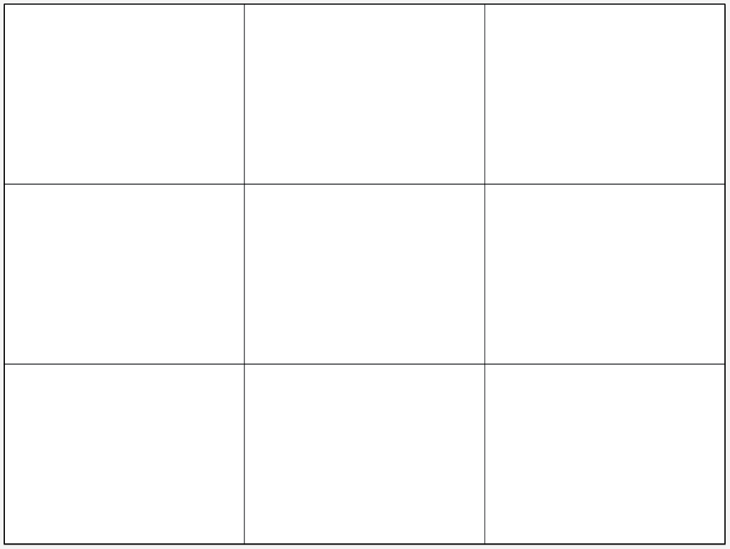
If you learn only one thing from this post, remember this rule as it is one of the most basic/important design rules. It is also very handy for photographers and could easily be implemented in your presentation. The setup is easy, just take your artboard (your slideshow page) and divide it into 3 columns and 3 rows of equal spacing (the image here is a 1024×768 px image divided into 9 compartments).

Now I’ve heard the rule of thirds presented in two ways, and I use both depending on the situation. The primary rule is that the subject of your image should be placed on the grid lines of your slide. If you have intersecting components, for instance a horizon line and a subject, then the intersection of your composition should be placed on an intersection point of your grid. Here is a great example of this in practice:

In this image the hawk is aligned with the right grid line, while the top of the grass (horizon) is aligned with the bottom grid. Using the rule of thirds in this way creates a new level of interest in your presentation, and leaves a lot of desirable white space to enhance the interest in your subject.

The other use of the rule of thirds is to place your entire subject into thirds of the space. This is a bit more difficult for me to explain, so I’ll go right into an example:

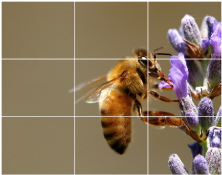
Here the flower occupies the entire right third of the image, and the bee occupies the middle third, leaving the final third for white space. In this photo the subject (the bee and the flower) takes up 2/3 of the image space and enhances the interest in the subject. Coincidentally the bee is centered in the image, which might give peace to those symmetry freaks. Bonus points if you noticed that the eye of the bee is aligned with one of the grid intersection points.

One way I use this is presentations is when making an outline (which I really don’t like to do). In the following example, I simplified my dissertation talk into 3 components and used an image to summarize each component:

Screen Shot 2013-05-22 at 5.35.52 PM

There are lots of ways to use this rule in presentations so don’t be afraid to experiment.

Use simple colors for backgrounds.

I’ve seen this violated in business presentations far more times than I have in science, but it still is worth mentioning.

Don’t use backgrounds that have textures, patterns, gradients, or distracting graphics.

It is too distracting to the eye, and your audience won’t be paying attention to you, they’ll be too busy recovering from their seizure. All kidding aside keeping your slide backgrounds simple will make your presentation easy on the eye. Believe it or not, my favorite background is a simple white background with black text. With great contrast comes great responsibility… or something like that.

If you want to go with better eye ergonomics, then use a black background with white text. You get the same level of contrast (maximum!) and you get an added benefit. Think about this from your audience’s perspective. They are sitting in a dark room, getting blasted in the face with bright photons bouncing off the projector. By making the background black the intensity of light reflecting from the screen is diminished and your audience is a little happier. If the lights in the room are at maximum, you may want to stick with the white background so they can actually see the slides.

If you insist on using color, then by all means do so, but stick to solid colors and use a font or image color that provides good contrast to your color. Having a basic understanding of color theory can be very helpful in this regard (See also HSV color space).

Pick quality fonts.

The choice of font will mostly go unnoticed if you go with classic choices like Times New Roman, Calibri, Arial, Myriad, etc. But if you choose to use fonts like Comic Sans (sorry Comic Sans, I had to…) your presentation will definitely be remembered, in a bad way. If you want to go with interesting fonts pick something that fits the theme of your presentation, but make sure it isn’t too distracting. Fonts may make for interesting design, but if your audience struggles to read it at a normal pace they will pay less attention to your message and spend more time trying to figure out what you wrote on screen, why you chose that font, what the funny shapes look like, and then your audience will be lost.

But even picking classic fonts don’t have to be boring. You can pair fonts to make headings enticing and body text readable. For instance, use Times New Roman for titles and Arial for your body. The content will still be readable, but you’ve added a new twist to the presentation. You can even reverse the scheme and go with Arial for the title and Times for the body. Here is a decent beginners guide to pairing fonts. And if you want to find some fun fonts to install on your computer check out some of my favorite resources for royalty free fonts: Da Font, Font Squirrel, and the Lost Type Co-op.

One idea per slide.

All designers advocate for keeping it simple, and some presentation designers incorporate this concept by keeping slides to 3 ideas. I like to take this two steps further by maintaining only one idea per slide. This can be especially handy for presentation styles like Ignite talks. By limiting the slide to just one idea, your audience has no choice but to focus on the one topic at hand and it will certainly make it easier to remember individual points over the remainder of the talk. If you have an image to share, show just the image and remove all the bullets, descriptions, etc (crediting a source is ok though). If you have a list, break the list into its components and put each component on one slide. Make it impactful by just writing the one idea and nothing else. The benefit here is that your audience literally has nothing else to focus on, so after they quickly read the concept they’ll be making great eye contact with you and giving you amazing positive feedback that will energize you through the rest of your talk.

Show only the most relevant information.

This rule is slightly piggy-backing on the previous rule, but comes into play more when you have no choice but to feature more than one object of focus. Presenting data is a good example of this. Most data is complicated, and as the presenter it is your job to simplify it. Making it obvious what your audience should be taking away from a figure is important. Most likely you won’t be on a data set for longer than 3-5 minutes, and if your data is complicated it may take much longer to digest that. Here is an example of some data from my research:

Screen Shot 2013-05-22 at 6.21.17 PM

In this example I was merely trying to show that the higher the concentration of heavy water (D2O), the slower the growth of yeast. As a secondary, I wanted to show the disparity between normal water (DI water, green) and 99.9% D2O (blue). Since it was important that each line be distinguishable, I chose various colors to represent each data set. To help distinguish DI water from 99% D2O, I made those two colors more prominent by making all the other colors more white (in this case I increased the transparency of the other lines). If I simply wanted to distinguish the two lines from each other while showing the other data I could have done something like this:

Screen Shot 2013-05-22 at 6.33.15 PM

In this case I made the extra lines gray so they don’t detract from my message, which is there is vast difference in growth between yeast grown in DI water vs D2O. In this case it’s really easy to distinguish the two data sets I want to feature. But I didn’t want to lose the gradual difference in growth rate, so I simply applied a color gradient to the other sets. As the concentration of heavy water (D2O) increases the color changes slightly.

This is a relatively simple data set to explain, but you can use similar design logic to convey more complicated results. It just takes a little patience to make sure you are really conveying the point you wish to make, and more importantly the information you want your audience to retain.

Break some rules!

Despite all the tips I’ve shared with you, sometimes you can’t convey your message within the constraints of simple design rules. So the final rule is provided, to give you the flexibility you need. But be warned, you should only break the rules if you really need. Here is a slide that is one such example:

Screen Shot 2013-05-22 at 6.41.18 PM

I used a busy background and a list of details to show the differences between hydrogen and deuterium (the stable isotope of hydrogen). I did use the rule of thirds to align the columns, but still I broke lots of rules. But there is a method to my madness.

First, the background was designed to illustrate a point. Each of the little dots is a graphic representation of a water molecule (not to scale). In this case I was trying to show the ratio of hydrogen to deuterium in nature, which is for every 1 deuterium atom there are 6,420 hydrogen atoms in 3,210 molecules of water. So on this slide I placed 3,210 molecules, of which, there is exactly one deuterium atom.

Second, the list was used to highlight the differences between deuterium and hydrogen, which is the one idea of the slide. I don’t expect my audience to remember all these details, I was merely trying to show differences between the two atoms that will later explain differences in the chemical properties of the two water types.

In order to convey my message effectively and impactfully I needed to break a few rules. But I don’t abuse this rule when designing presentations, and you shouldn’t either. Combining the tips provided here will give you the most impactful science talk many of your peers will have personally witnessed. As a final example, here is my dissertation defense in it’s full glory. Take note of my use of each of the rules and try and understand my motivations on slides where I break the rules. If you have any questions feel free to tweet/email me or just leave a comment below.

#Scifund Outreach Training: Week 1

The first week of the first ever Scifund Outreach Course (Scifund Outreach 101) is now complete.

Week 1 was mostly set up and getting familiar with the environment, as we requested students sign up for Twitter, Google+, Wikispaces (Scifund Wiki), and Google Groups, and then start playing around.  We also asked students to sign up for Google Hangouts with us for some wonderful discussion into what is holding back science outreach.

If you didn’t get to sign up for a hangout, or aren’t registered for the course, don’t fret! I’m going to share some of the questions that were discussed along with the perceptions of science outreach in the scientific community. As you read this post, I want you to think about the topics discussed and how these perceptions affect your contribution to science outreach.

Is your scientific network supportive? (This includes collaborators, advisors, department, etc.)

To me, this was the most important question asked in the hangouts that I hosted. It was also the question that got the most varied responses. There are a number of motivating factors that push a person into science outreach, and most definitely one of those factors is the environment. Obviously, every person is different, but I feel it is safe to say that scientists who are encouraged and trained to communicate effectively will be more inclined to do so compared to people who are discouraged.

The point of this outreach course is to provide this very environment.

So how supportive is your network?

Some students find themselves in very encouraging labs and organizations. Others find themselves in discouraging situations. But even when your network isn’t directly discouraging, it could be indirectly so. In this scenario, advisors, collaborators, and supervisors won’t go out of their way to discourage outreach, but they don’t see the value of it and disregard outreach as a waste of time. In this situation, students may find themselves passively discouraged, through priority: “You should be doing research instead.”

What, personally, is holding you back from doing outreach?

Like I said, there are many factors that contribute to your outreach efforts, outlooks, etc. In the hangout sessions, I always tried to ask what their fears and hurdles are when doing outreach. If only I had thought to phrase it like this! This question was most important for students to hear other students’ perspective. Knowing that your peers are having the same issues as you, helps you understand that you are not alone in your efforts. And not surprisingly, many of the students have the same restrictions.

The biggest restriction is technological challenge. Simply put, there are a lot of tools on the web and it is impossible for anyone to keep up with all of them. More so, it is difficult for anyone to even be experts at a lot of them. How do you work around this? Develop a strategy. This will allow you to understand what you need to do, and what tools you will need to fulfill that strategy. This will minimize the time you spend learning tools, and maximize your effort and engagement.

The other major hurdle is the communication barrier. Everyone in the course acknowledges that communication is key, and that everyone could benefit from developing their communication skills. Why can’t all scientists think this way? What many of the discouragers fail to realize is that outreach is excellent for developing communication skills that are vital in scientific careers. Every scientist will give a talk about their research at some point in their career. That presentation could earn you a degree, a job, a collaboration, etc. So why not give the best possible presentation?

Are there any potential career conflicts with outreach?

I got into this a little above, as outreach can give you skills that can enhance your career. But this answer is kind of a response to the thinking that outreach is a waste of time. Many of the students in my hangouts discussed potential negative backlash from outreach, which was highlighted in this video:

Despite the ultimate in outreach horror stories, Sarah manages to maintain a positive attitude. But how frequently do these horror stories occur? What if your message isn’t what the public wants to hear? Is there a stereotype for scientists who do outreach? (Ie, they can’t cut it in the research world.)

These are all very valid questions, and some are pretty scary to think about, especially when they affect your career. I don’t have any outreach horror story first hand, but I doubt they are frequent. If there was a common backlash from outreach, no one would do it.

But what about the misconception of scientists who do outreach? That is just a misconception. There are many scientists who survived the rigors of their PhD program, braved their post-docs, and walked through fire to get tenure, and do outreach. In some cases scientists may make a career change to do outreach full-time. In these situations many of the scientists involved were recruited to use their analytical skills to present the truth. After all, why not digest information directly from an expert in the field?

Outreach doesn’t necessarily need to be solely about communicating research to the public. It can also be a collaborative environment. In some hangouts, the discussion moved toward combining research and outreach. Citizen science projects are the best example of this. By communicating properly, web surfers are recruited to contribute to science directly through projects like the Galaxy Zoo. Even open notebooks (like this one here) provide some collaboration of science outreach and research. If communicated properly, you may even have some public engagement.

Conclusion

There is a lot to consider when starting an outreach campaign. Identifying the hurdles in your path can help you overcome those hurdles, which make it much easier to define your outreach plan and achieve it. The motor behind outreach is your ability to communicate, and the desire to improve your communication skills will help you develop your outreach plan. In fact many of the discussions gravitated toward developing your message for communication. In week 2, students will be using the “message box” approach to develop their message, and if you are following along you should too. I’ll be writing my message box and will post it here for everyone to see.

Update:  This post is now up on the #Scifund Challenge Blog.